The design question
Explore a shopping experience that gives products room to stand out while helping visitors understand where to go next.
 Let's talk
Commerce storefront · concept study
A storefront concept exploring thoughtful product discovery and a consistent shopping experience across screens.
Illustrative design concept. Not a delivered client project, live product or measured business result.
Explore the thinking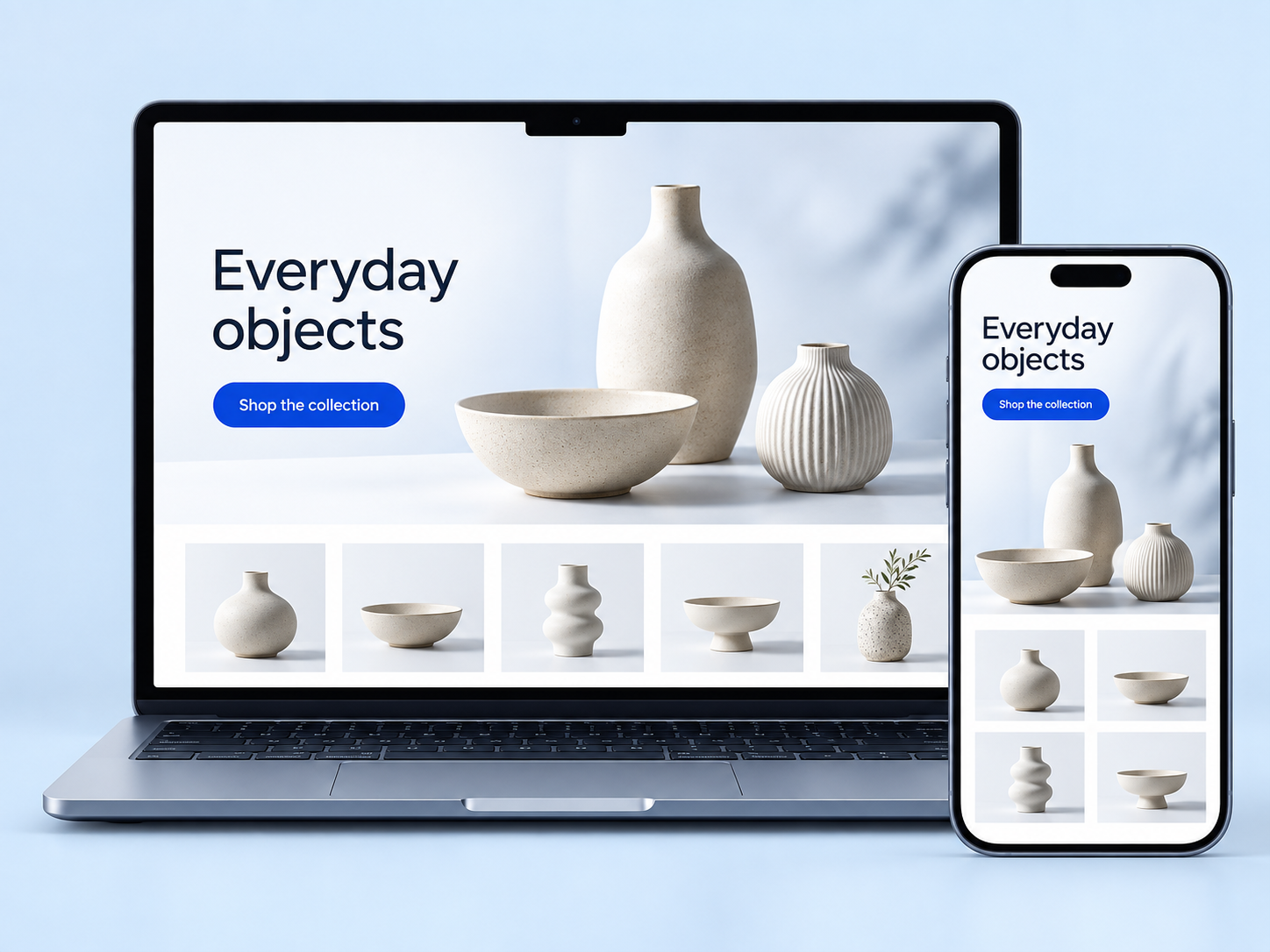
01 / The opportunity
Explore a shopping experience that gives products room to stand out while helping visitors understand where to go next.
Lead with considered product imagery, a simple collection structure and a consistent visual language across desktop and mobile.
A design hypothesis to explore—not a finding from completed user research.
02 / The design direction
Three ideas behind this visual direction. Each would need to be explored and tested in a real product context.
Use product photography and a restrained interface to give the collection space. The first screen introduces the products and offers an obvious route into browsing.
Image-led product discoveryA consistent product grid could help visitors compare what they see. The design direction favours a clear sequence of collection, product information and next action.
Clear collection navigationCarry the same typography, colour and collection language from desktop to mobile. The concept explores a recognisable storefront rather than two unrelated browsing experiences.
A connected cross-screen experience03 / A proposed journey
A proposed shopping journey for a future prototype. The image shows storefront design, not an operating store, inventory system or payment flow.
Move from the opening story to a useful selection of products, with navigation that explains the catalogue.
Explore a detail view for imagery, variants and the information a customer needs before making a choice.
Plan a clear way to check selections and continue towards a separately scoped checkout experience.
Proposed interaction flow · not a live product demonstration
04 / What comes next
A useful next step would be a focused prototype and a review with the people who would use it. These are the questions this concept leaves open.
Have a similar challenge?
Discuss your project